


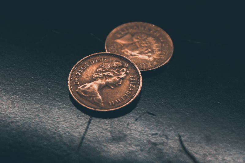
Photo by Siora Photography on Unsplash
Rotate a 2-sided Object to Show Both Sides with CSS
Build this cool visual effect with multiple animations.
2023-06-23T13:51-07:00
I recently worked on a project that involved flipping a coin. It had to spin rapidly on the screen while showing each distinct side.
"I'll just stack two circles and rotate them." How easy, or so I thought.
Layering two divs and rotating their container isn't enough to show the other side. The layer with the higher z-index, either explicit or implicit, will always be on top. My next attempt involved three animations: one that rotated the coin and two others that alternated the z-index of each side.
Running these multiple animations looked fine on desktop sites, but it appeared glitchy on mobile. That's when I found the final answer: transform: translateZ().
By pushing each side slightly along their z-axis in different directions, then preserving this 3D layout within the coin container, I was able to get the animation running perfectly.
Embarrassing side note: and even before I tried running multiple CSS animations at once, I toggled each z-index with a timed JavaScript function (yikes 😳). It just shows how there can be many ways to do the same thing in web development, but in my opinion the following method is the simplest for spinning a two-sided object:
Creating the coin
HTML
The coin is a div element with two div child elements representing the coin's sides.
<div class="coin">
  <div class="back side"></div>
  <div class="front side"></div>
</div>
CSS/Sass
The coin will be 100 pixels both tall and wide with a red back and a blue front. We need to separate each side by moving them in opposite directions along their z-axis. This is done with transform: translateZ(). Finally, we need to set transform-style: preserve-3d on the container.
.coin {
  height: 100px;
  width: 100px;
  position: relative;
  transform-style: preserve-3d;

  .side {
    height: 100%;
    width: 100%;
    border-radius: 50%;
    position: absolute;

    &.back {
      background-color: red;
      transform: translateZ(0.1px);
    }

    &.front {
      background-color: blue;
      transform: translateZ(-0.1px);
    }
  }
}
Animations
Spin the coin rapidly
This simple animation spins the coin on its x-axis from 0 degrees to 360 degrees.
@keyframes spin {
  0% {
    transform: rotateX(0deg);
  }
  50% {
    transform: rotateX(180deg);
  }
  100% {
    transform: rotateХ(360deg);
  }
}
Putting it all together
For the final step, all that's left is to add the animation to the coin's container element.
.coin {
  animation: spin 0.75s infinite;
  ...
}
Play with my code
See the code in action here, or download the code here.